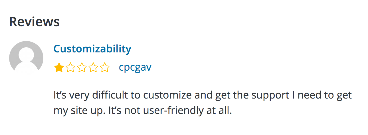
The latest version of the WordPress.org plugins page contained the full text of the last two reviews, even if those reviews are false or mis-leading. What’s worse is even if you reply and try to resolve that issue, your reply and any resolution is never shown on your plugin homepage, which doesn’t make it very useful for those evaluating if your plugin is right for them.
I advocated to get this removed as it was ripe for abuse and sure enough, shortly after I got hit with my own 1-star review:

The user never asked for support, and all the cpcgav user account has done is submit 1-star reviews. I replied nicely (as did a happy user of the plugin, which I appreciated!) to try and resolve.
But my nice reply and the legitimate question by the nice user of my plugin doesn’t appear on the plugin homepage under the current design, just their review in full. There isn’t even an indication that I cared to reply.
Compare this to the process in the old design of:
1) seeing the average rating and number of 5 star vs 1 star reviews
2) clicking view all reviews (or just 1 star directly)
3) see just the title text and star rating, along with number of replies
4) then seeing their full text once drilled down
The old design gives far more context to the overall state of the plugin, what the average and even most recent few users think about it, and what the plugin authors are doing in response, all before seeing their rating text (positive or negative) in full. Showing it in full just gives users an unedited soapbox to say whatever they want.
Without a way to rate the usefulness of ratings themselves it needs to be removed from the plugin homepage.
So I’ve submitted a patch to have the full display removed. Show your support by watching the ticket (click the star near the bottom), and chime in on the #meta WordPress Slack channel.