If you’re just uploading a full size image and inserting it into your WordPress post or page, chances are your image is too large.

The above is from a WordPress site where a single image is negatively affecting the page load time and is 1.6MB in size. What’s worse is this image is a much larger width and height than you’re actually visibly seeing on the page so there’s no real benefit to downloading this larger, higher quality image.
Beyond optimizing the large image so it’s as small as possible without compromising image quality, you also want to give visitors the smallest size image based on their screen size. There’s no sense in downloading an image that is wider and taller than you can actually see on the screen.
How to Check the Actual Size of an Image
We can take a closer look at an image we’re seeing on a page to know if there’s a problem with a larger-than-necessary image being used.
Using Google Chrome, you can right click on an image and choose Inspect Element from the menu that appears. In the window that appears, hover your mouse over the “img” tag that’s already highlighted and you’ll see something like this:
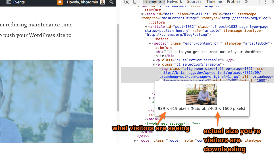
In this case the visible image size is 929 pixels wide while the width of the image that’s being downloaded is 2400 pixels.
On mobile it’s even worse. They’re downloading that same 2400 pixel width, full size image but only seeing a much smaller size of it. And it’s costing those mobile visitors more money to visit your site, too.
One way to help is to use a responsive image, which will respond to the screen size and use the right size version of the image for the job. No more downloading a huge image when you only need a small one.
Adding support to show a different size of an image has been difficult to do without using a plugin but starting with WordPress 4.4 (scheduled for release early December 2015), that’s about to change. You’ll be able to add the full size or larger image to your WordPress post or page, and WordPress will handle giving a smaller size image to visitors with smaller screens or on mobile.
Introducing Responsive Image Support in WordPress
WordPress 4.4 will finally make giving visitors the best and smallest version of the image for their device easy and no different than just adding an image into your page or post like you are now.
Once you have upgraded to WordPress 4.4 or later, you can upload the full size of your image and then insert it into your page or post as the larger size:
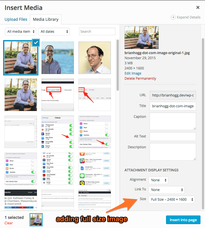
In this case I’m adding the full size to demonstrate how it works, but you can add in a smaller size based on the maximum width it’ll appear on your page.
Publish the page then check the image by right clicking on the image in Chrome and choosing Inspect Element. Hover over the “img” tag that’s highlighted and you’ll see something different:
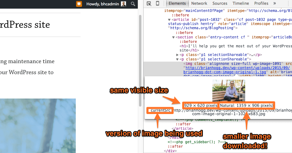
The width of the image being downloaded is smaller but still looks like the same size image when viewed in the browser.
And the performance increase is massive. In the case of my image, a photo of yours truly taken by the awesome and talented Adam Wills, it’s now an image that’s less than half the size and way smaller – about 3000k originally down to about 250k, or around 8% of the original file size.
The result is even better on a mobile device where it’ll download a smaller size image based on the smaller width of the mobile screen.
Get the most of Responsive Images with this checklist!Do All Browsers Support These Responsive Images?
Not yet, but most modern browsers will. If a visitor is using an older, unsupported browser, they’ll just see the larger image as they did before, so it’s still important to optimize your images and insert the largest size you actually need.
What About Existing Images Added Before Upgrading to WordPress 4.4?
What if you’ve got a bunch of existing images? It’d be pretty annoying to re-upload or re-add all of them to get the benefit of better image sizes.
I upgraded my test version of brianhogg.com to the latest beta version of 4.4 to confirm how the old image on an existing page would be handled and sure enough, my full size image was automatically made responsive. Problem is it’s missing the new “medium large” image size added in 4.4.
To generate this new image size just install the Regenerate Thumbnails plugin to regenerate the smaller sizes for your existing images. Once installed, go to the Tools menu then the Regen. Thumbnails option:
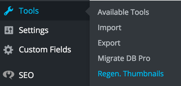
Then hit the Regenerate Thumbnails button. You’ll see the progress of your thumbnails updating:
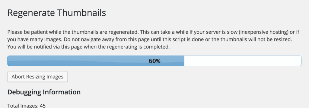
Once completed find a large image and in Chrome, right click on the image and choose Inspect Element to see the image sizes. There’s now a new 768w option which is the new “medium large” image size.
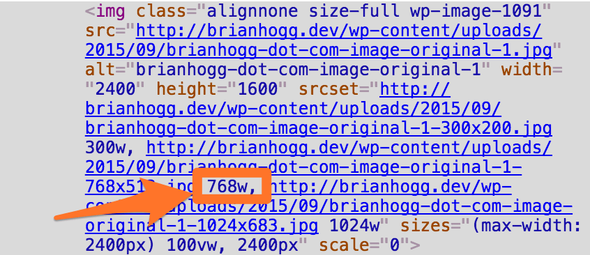
If you don’t see this, try refreshing the page and clearing any caches you have setup. You may also need to add post thumbnail support to your theme if you don’t already have it:
add_theme_support( 'post-thumbnails' );
You don’t need to do this regeneration process again as future images you upload to your site will have the new size generated for you automatically.
Can I Choose How The Smaller Images are Generated?
WordPress will automatically generate the smaller versions of your images and in the same aspect ratio as the original. From what I can see using a plugin like Crop Thumbnails will not work as the smaller images that are being generated are not the same as the thumbnail sizes added by your theme.
I think this is something that WordPress or a separate plugin should eventually support, to handle having a different crop or zoom for the different size images for the purpose of art direction.
Conclusion
Thanks to responsive image support in WordPress 4.4, your site will be a lot faster and your visitors will thank you. Just upgrade your site when it comes out, regenerate the thumbnails, and enjoy!
Having issues upgrading your site to the latest version of WordPress? Drop me a note so I can see if I can help.